
Friday, 18 February 2011
Ideas
The three of us are very like minded in terms of design, and this helps out a lot in a prject such as this. We seem to have very similar ideas in terms of layout, colour and shape for things such as products or graphics, so we should be able to complete a design fairly quickly.
As you can see from the images below, we want to go very crisp and minimalist in our design approach to this exhibition.
Apple products are a great example of how simple something can be but to great effect. They are known for their high end spec products, a must have item. The clean lines and solid colours give great effect and make the products look classy.
We want to bring this sort of design into our exhibition, along with interaction.

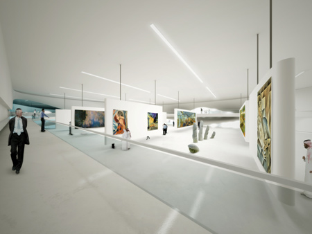
Here is a great example of a modern exhibition. Its highly neatrul colour scheme brings out the work and showcases it perfectly. This is something we want to try and do.

As you can see from the images below, we want to go very crisp and minimalist in our design approach to this exhibition.
Apple products are a great example of how simple something can be but to great effect. They are known for their high end spec products, a must have item. The clean lines and solid colours give great effect and make the products look classy.
We want to bring this sort of design into our exhibition, along with interaction.

Here is a great example of a modern exhibition. Its highly neatrul colour scheme brings out the work and showcases it perfectly. This is something we want to try and do.
Museum Visits
For some inspiration, we took a trip to London to some of the Museums to see how they present work around their exhibitions.
We first took a trip to the V&A (Victoria & Albert) Museum. This museum is a more traditional museum in terms of layout and content. It's simple exhibitions let the work do the talking rather than the exhibition design itself.


Next we visited the Science Museum, which is a place I really enjoy. It's jam packed full of stuff, crazy exhibits, bright colours, unusual content. It draws you in and throws info at you in a fun way. The content is the exhibition which is something I think we want to try and replica in our exhibition. Rather than have work on a stand, make that work interactive, draw the viewer in.


Brainstorming.
Finding ideas for the Exhibition should come quite naturally. I've teamed up with my two good friends Jack Draper and Glenn Osborne again for this project, so we should come up with a good design for the Exhibition. Our idea will contest against other groups in the module for the Final Design of the Exhibition, so we have to make this one a good one!
Friday, 11 February 2011
An Exhibition
For this module, we will be creating and hosting an Exhibition within the University, displaying our work that we have done throughout our course here at Anglia Ruskin. This could be interesting, bringing up old projects and displaying them along side my newest work.
Subscribe to:
Posts (Atom)